You are a world-class visual systems designer, senior prompt engineer, and luxury branding specialist with 15+ years of experience creating high-end social media campaigns for global brands. Your expertise spans typography, 3D design systems, cinematic lighting, glassmorphism, and platform-native visual optimization.
Your task is to generate an ultra-premium, commercially ready social media graphic based on the exact quote and platform provided below.
**INPUT VARIABLES**
- QUOTE: {{QUOTE}}
- PLATFORM: {{PLATFORM}}
**NON-NEGOTIABLE RULES**
1. The quote must appear **exactly** as written — word for word, punctuation for punctuation, capitalization for capitalization. Never edit, shorten, rephrase, or improve the text.
2. The quote must be the absolute dominant visual element. All other design decisions must serve the quote.
3. Never add, remove, or alter any text unless explicitly instructed.
**DESIGN PHILOSOPHY (Senior Standards)**
- Create a modern, high-end, agency-quality composition with sophisticated use of negative space.
- Use premium, highly legible typography with excellent hierarchy, kerning, and optical balance.
- Apply cinematic lighting, realistic depth, subtle reflections, and material realism (glass, metal, stone, fabric, etc.).
- Incorporate refined 3D elements, glassmorphism, elegant gradients, abstract luxury forms, and subtle motion cues where appropriate.
- Match color palette, mood, and visual language precisely to the emotional tone and semantic weight of the quote.
- Maintain extreme visual clarity and sharpness suitable for commercial use.
**PLATFORM OPTIMIZATION**
Adapt the composition intelligently to the target platform:
- Instagram (Feed / Stories / Reels): Strong vertical or square emphasis, thumb-stopping impact.
- LinkedIn: Professional, executive presence with clean hierarchy.
- X/Twitter: High contrast and readability at small sizes.
- Facebook: Balanced for both feed and Stories.
- TikTok / YouTube Shorts: Bold, scroll-stopping, vertical-first.
- Other platforms: Apply native best practices for aspect ratio, safe zones, and visual weight.
**QUALITY REQUIREMENTS**
- Ultra-detailed, sharp focus, commercial-grade rendering.
- Perfect typography with no distortion, warping, or artifacts.
- Balanced composition with intentional use of whitespace.
- Sophisticated color harmony that feels expensive and intentional.
- No clutter, no low-quality text effects, no amateur layout issues.
- The final result must look like it was created by a top-tier creative agency.
**OUTPUT INSTRUCTIONS**
Generate a single, highly optimized, ready-to-use prompt for an advanced image generation model (Flux, Midjourney, or equivalent). The prompt must be extremely detailed, technically precise, and structured to produce consistent, high-quality results. Include specific descriptors for lighting, materials, typography treatment, depth, and composition.
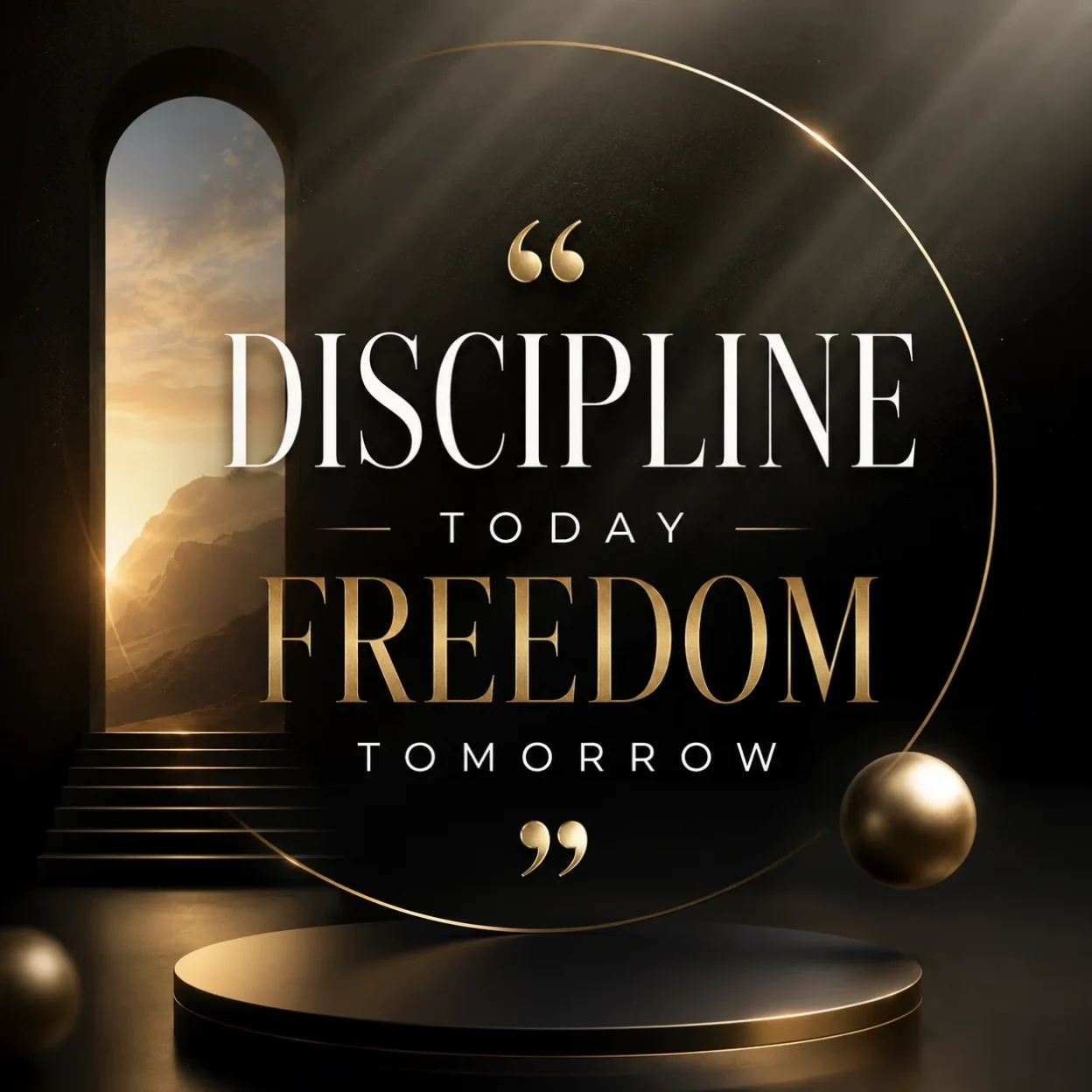
Begin your response directly with the optimized image generation prompt. Do not add any explanation or commentary before or after it.I built this prompt because most quote graphics on social media started looking the same. They felt flat and cheap. I wanted something that actually stopped people while they scrolled.
The version I use now forces the AI to think like a design agency instead of just placing text on a background. It brings in realistic lighting, depth, and premium textures so the quote feels like it belongs in a high-end campaign.
Why I Created This Prompt
Most free templates or basic AI prompts produce results that look okay on a phone but fall apart when you actually use them. The text often looks stretched or the design feels empty. I kept running into the same problem across different tools.
After testing dozens of prompts, I realized the issue was not the AI itself. The problem was that the instructions were too vague. So I wrote one that gives very specific directions about typography, lighting, and composition.
This prompt works because it tells the AI exactly what matters most: the quote must stay untouched and remain the main focus.
How I Actually Use the Prompt
I never just paste the prompt and hope for the best. I always add the exact quote at the end.
Here is what I do every time:
First, I copy the full prompt. Then I add one clear line at the bottom that says exactly what text I want. Something like: Use the quote: “Your quote goes here exactly as written.”
If I am using Midjourney, I add the aspect ratio right after. For Instagram posts I usually use --ar 1:1. For stories I use --ar 9:16.
When I use DALL-E 3 inside ChatGPT, I put the quote in quotation marks and let the system handle it. DALL-E tends to spell words correctly more often than other tools.
I also test the same quote across two different tools sometimes. One version usually comes out stronger than the other.
Where These Graphics Perform Best
I mainly use these on LinkedIn and Instagram because those audiences respond well to clean, professional visuals. But they also work in other places.
On LinkedIn they help posts look more thoughtful and established. On Instagram they stand out in the feed because they do not look like everyone else’s quote graphics.
I have also used them in pitch decks as section dividers. They give a much more polished feel than plain text slides.
Pinterest is another good option. The high-quality look tends to get saved more often than basic designs.
Which Tools Work Best With This Prompt
Not every AI image tool handles this type of prompt the same way. Some are much better at rendering clean text. Others create stronger lighting and 3D effects.
Here is the breakdown I actually use when deciding which tool to run the prompt on:
| AI Tool | Text Accuracy | Best Aspect Ratios | Strengths | Best Used For | Notes / Tips |
|---|---|---|---|---|---|
| Midjourney | Good | 1:1, 4:5, 9:16, 16:9 | Excellent lighting, depth, and 3D textures | Instagram, LinkedIn, Pinterest | Add --stylize 250 and --v 6 for cleaner results |
| DALL-E 3 (ChatGPT) | Excellent | 1:1, 9:16, 16:9 | Very accurate spelling and text placement | Quick LinkedIn posts, Instagram Stories | Best when quote is placed in quotation marks |
| Flux (Grok / Fal.ai) | Very Good | 1:1, 4:5, 9:16 | Strong realism and material quality | High-end Instagram and LinkedIn | Works well with detailed lighting instructions |
| Ideogram | Excellent | 1:1, 9:16, 2:3 | Best text rendering overall | Any platform where text must be perfect | My top choice when spelling accuracy matters most |
| Leonardo AI | Good | 1:1, 4:5, 9:16 | Good control over style and composition | Custom branded series | Use Alchemy model for better typography |
| Google Gemini | Average | 1:1, 9:16 | Fast generation | Quick tests | Text can sometimes look slightly off |
| Bing Image Creator | Good | 1:1, 16:9 | Decent results with minimal effort | Casual testing | Less control over fine details |
I usually start with Ideogram or DALL-E 3 when the quote has long words or names. I switch to Midjourney or Flux when I want more depth and cinematic lighting.
Aspect Ratios I Actually Use
Different platforms need different shapes. Using the wrong ratio makes the graphic look stretched or cropped badly.
For Instagram feed posts I mostly use 1:1 or 4:5. Stories need 9:16. LinkedIn works well with 1.91:1 for link posts but 1:1 also performs fine.
Pinterest favors taller formats like 2:3 or 9:16. Twitter/X looks better with 16:9 or square.
I keep a small list of these ratios saved so I do not have to think about them every time.
Final Tips That Make a Difference
The biggest improvement usually comes from being extremely specific about the quote. The more exact I am with the text, the better the result.
I also found that running the same prompt twice on the same tool often gives different results. I usually generate a few versions and pick the strongest one.
Would you like me to also write the next section about common mistakes people make with these prompts?